Interactive
Walker Art Center "Better"
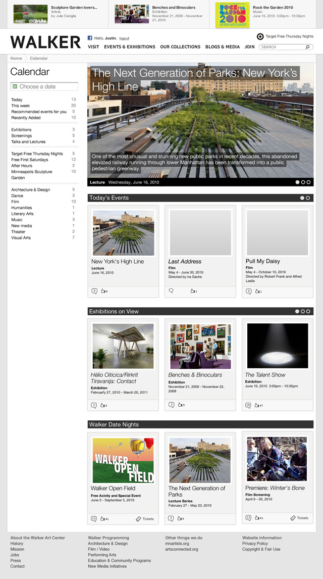
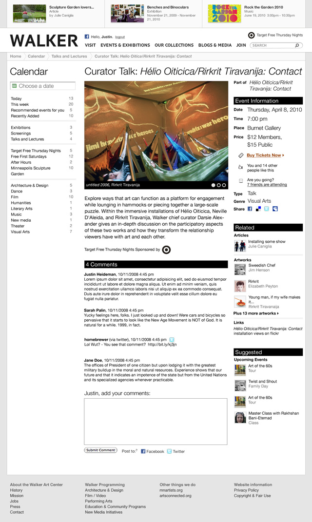
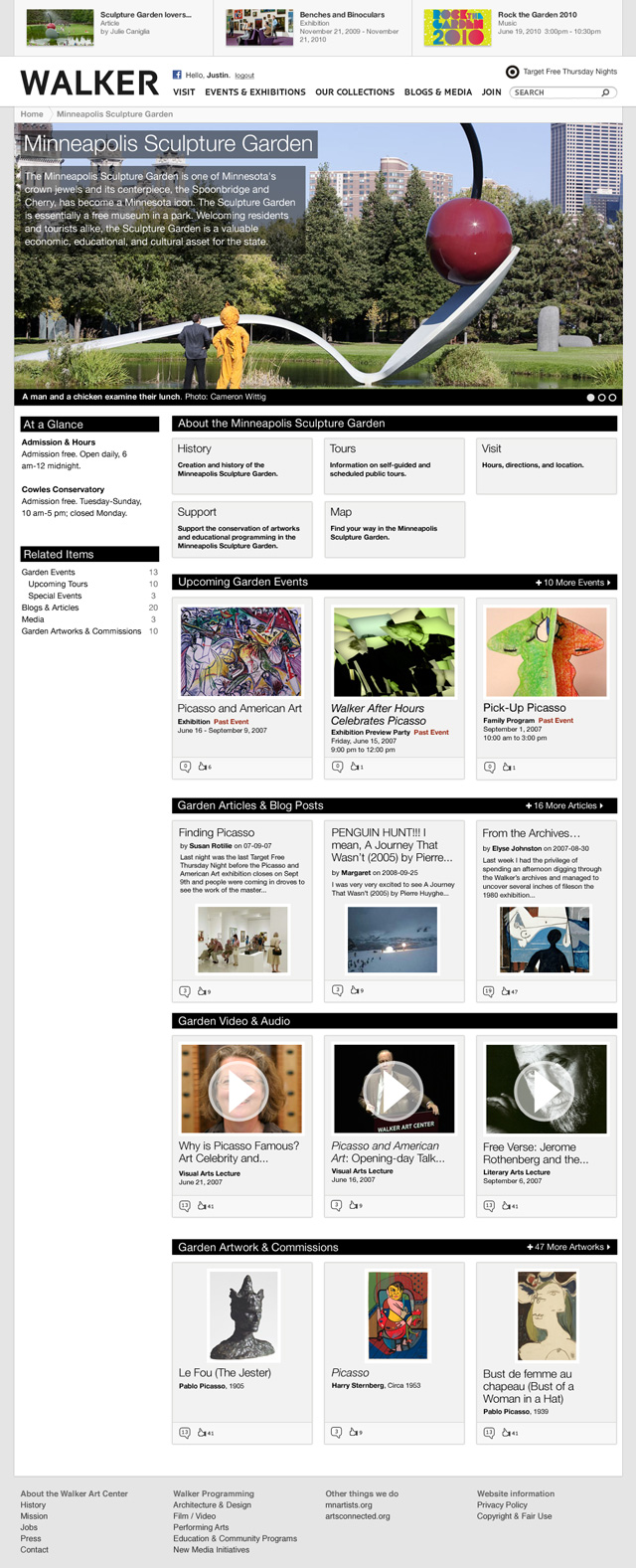
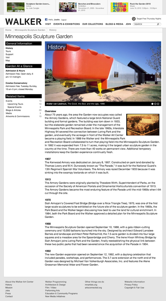
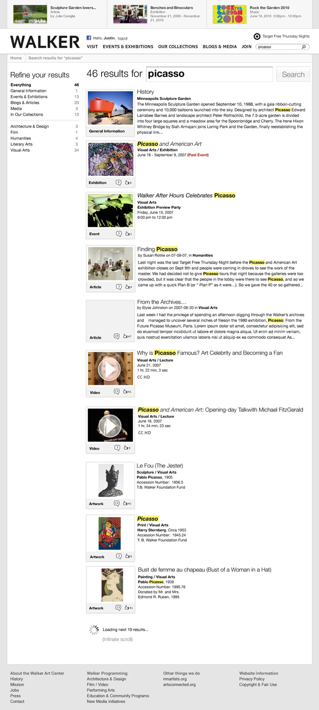
Prior to my departure as Senior New Media Designer at the Walker Art Center I worked on a project code-named "Better". "Better" was a full redesign and rethinking of the Walker website. The previous site had the concept of "neighborhoods" which were visually distinct areas of the website. The redesign would consolidate the design into one overarching Walker theme modeled after our print magazine (which was being redesigned in tandem with the website).
A major goal of the design was to push writing and articles more than before. We were trying to move the museum beyond the events and artwork it contained and position the Walker as a leader in art journalism and promotion around the globe.
I left the Walker previous to the completion of the project which would finally launch over a year later. Many of the original ideas brainstormed made it into the final website relaunch.